
A visitor decides whether to stay on your page in a matter of seconds, and they make that call based almost entirely on what they see before scrolling. That first screen is your above the fold section, and if it does not communicate value and point to a clear next step, most people leave before they ever see the rest.
Good above the fold design does three things fast: it says what you offer and who it is for, it shows one obvious action to take, and it makes the eye land on both without effort. People do scroll these days, but they still decide whether to bother based on that first screen. Here are six easy rules to get it right.
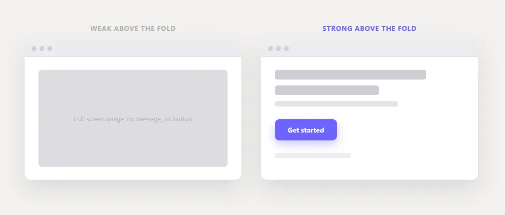
Table of Contents
What “above the fold” actually means
“Above the fold” is the part of a page a visitor sees before scrolling. The term comes from newspapers, where the most important story sat above the physical fold. On the web there is no fixed fold, since it shifts with every screen size, which is why some people claim it no longer matters.
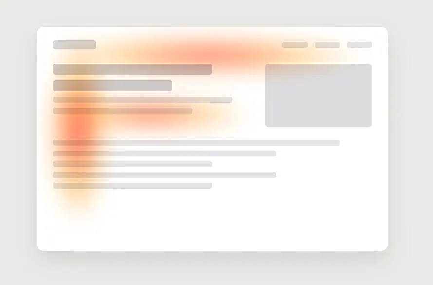
The data disagrees. Eye-tracking research from the Nielsen Norman Group found visitors still spend most of their attention above the fold, about 57% of their viewing time on the first screen, even though scrolling is now second nature. People scroll, but only if that first screen gives them a reason to.
6 rules for an above the fold design that converts
1. Lead with a clear value proposition. Say what you do and who it is for in a single glance. A visitor should understand your offer in the time it takes to read one headline, not after decoding a clever tagline. Clarity beats cleverness every time on the first screen.
2. Put one primary call to action in view. The single action you most want visitors to take should be visible without scrolling. One primary CTA, not five competing ones. Make it obvious enough that nobody has to hunt for it, and if it still blends in, a free plugin like GlanceLeader can draw the eye to it with a subtle cue, no code.
3. Guide the eye with visual hierarchy. Your value proposition and CTA should be the loudest elements on the screen, with everything else visibly quieter. This is where deliberate visual hierarchy does the heavy lifting, using size, contrast, and spacing to lead the eye in the order you intend.
4. Show, do not just tell. A relevant image, product shot, or short demo that supports your message helps visitors grasp it instantly. The visual should reinforce the value proposition, not just decorate the page. A pretty hero image that says nothing is wasted space.
5. Cut the clutter. Every extra element above the fold competes with your message for attention. Remove or shrink anything that is not pulling its weight, and be especially wary of giant auto-rotating carousels, which bury your best message and rarely get clicked past the first slide.
6. Give a reason to scroll. The first screen should feel complete enough to trust, but not so complete that visitors think they have seen everything. A visible hint of content below, a partial section or a downward cue, beats the “illusion of completeness” trap where people assume the page ends at the fold and leave.
Common above the fold mistakes
Most weak first screens share the same handful of problems: a vague or clever headline that does not say what the product does, no visible call to action, a large hero image with no supporting message, an auto-playing carousel that hides the main point, or a wall of text that no one will read. If your above the fold section has any of these, fix them before you touch anything below.
How to test your above the fold section
Do not rely on your own opinion, since you already know what your product does. Run the five-second test: show someone your first screen for five seconds, take it away, and ask what the site offers and what they would do next. If they cannot answer both, your above the fold design is not doing its job. Back that up with scroll-depth data or a heatmap to see how far people actually get.
The takeaway
Your above the fold section is a handshake: a few seconds to say what you offer, show one clear action, and make both impossible to miss. Nail the value proposition, keep a single visible CTA, and use strong hierarchy to guide the eye. Everything else is secondary, and it all serves the same goal of increasing your conversions.
Frequently asked questions
What does “above the fold” mean?
It is the portion of a web page a visitor sees before scrolling. It varies by screen size, so there is no single fixed line, but it is the first impression that decides whether people keep reading.
Does above the fold still matter if people scroll?
Yes. Visitors scroll more than they used to, but eye-tracking research shows the majority of attention still lands above the fold. The first screen decides whether they bother scrolling at all.
What should go above the fold on a landing page?
A clear value proposition, one primary call to action, and a supporting visual. That trio lets a visitor understand your offer and act without scrolling.