Roughly seven out of every ten shoppers who add something to their cart leave without buying. That is not bad luck – it is the Baymard Institute’s long-running benchmark of about 70%, and it has barely moved in almost two decades. The good news: most of that abandonment comes from a short list of fixable problems, not from people who were never going to buy.
Table of Contents
To reduce cart abandonment, you attack the friction between “add to cart” and “order complete”: surprise costs, forced account creation, a long checkout, and weak trust. Here are eight easy fixes for a WooCommerce store, most of which take minutes.
Why shoppers abandon their carts
The causes are well documented and consistent year after year. The number one reason is unexpected extra costs – shipping, taxes, and fees that only appear at the final step. Close behind are being forced to create an account, a checkout that is too long or complicated, not trusting the site with card details, too few payment options, and unclear delivery or return terms. Almost every one of these is something you control.
8 ways to reduce cart abandonment in WooCommerce
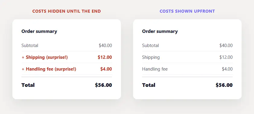
1. Show all costs upfront. Surprise shipping and fees at the last step are the single biggest cause of abandonment. Display a shipping estimate and taxes early – on the cart page, or even the product page – so the total at checkout is never a shock.
2. Offer guest checkout. Forcing shoppers to create an account before buying is one of the fastest ways to lose them. Turn on guest checkout in WooCommerce so people can buy first and register later, if at all.
3. Shorten the checkout. Every extra field is a chance to quit. Remove anything non-essential, keep it to as few steps as possible, and enable address autofill so returning shoppers barely have to type.
4. Add trust signals at checkout. People hesitate right before entering card details. Place security and accepted-payment badges near the pay button, and add a short line of reassurance about safe, encrypted payment. Small signals, real impact.
5. Offer multiple payment options. If a shopper’s preferred method is missing, they leave. Support major cards plus at least one express wallet like PayPal, Apple Pay, or Google Pay so nobody hits a dead end at the last step.
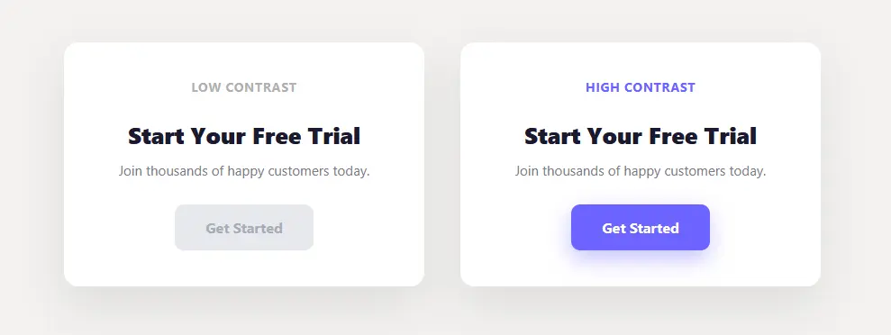
6. Make the next step obvious. At each stage of checkout, the primary button – Continue, or Place Order – should be the clearest thing on the screen, never competing with secondary links. This is the same idea as making your Add to Cart button stand out, applied to the whole checkout path.
7. Be honest about shipping and returns early. Vague delivery times and hidden return policies breed last-minute doubt. State clear shipping windows and an easy return policy before checkout, not buried in a footer link.
8. Recover the rest with abandoned-cart emails. Some shoppers will always leave. A well-timed automated reminder email – set up with a WooCommerce abandoned-cart plugin – wins a meaningful share of them back.
How to measure your cart abandonment
You cannot fix what you do not track. Watch your funnel from add-to-cart to checkout to completed order in WooCommerce analytics or GA4, and find the step that loses the most people. That single step is where your next fix will pay off most – work it, then move to the next leak.
The takeaway
Cart abandonment is not a mystery, it is friction and doubt at checkout. Show costs early, let people check out as guests, keep the form short, and build trust at the moment of payment. Every bit of friction you remove is revenue you were already leaving on the table – and it all serves the same goal of increasing your conversions.
Frequently asked questions
What is a good cart abandonment rate?
The average is about 70%, so anything meaningfully below that is good. Mobile runs higher (mid-80s) than desktop, so judge your store against its own device mix and trend over time.
What is the number one reason for cart abandonment?
Unexpected extra costs – shipping, taxes, and fees revealed only at the final step. Showing them earlier is the highest-impact fix.
How do I reduce cart abandonment in WooCommerce?
Show costs upfront, enable guest checkout, shorten the form, offer multiple payment methods, add trust signals at payment, and recover stragglers with abandoned-cart emails.