How to Write Call-to-Action Copy That Makes People Click

A purple speech bubble standing out among grey speech bubbles, illustrating call to action copy

You obsess over your button’s color, size, and placement – and then you label it “Submit.” The words on a button do as much work as its design, and “Submit” throws that work away.

Good call to action copy is specific, action-led, and framed around what the visitor gets. Swap vague labels like “Submit” or “Click here” for a short phrase that says exactly what happens next – “Start my free trial,” “Get the free guide.” Here are six easy rules for writing call to action copy that gets clicked.
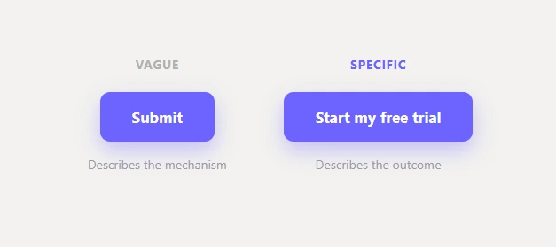
Weak versus strong call to action copy on a website button

Why the words on your button matter as much as the design

A button is a decision point, and its label is the last thing a visitor reads before acting. A vague label creates a flicker of hesitation (“what happens if I click this?”); a specific one removes it. Usability researchers call this information scent – a good label tells people exactly what’s on the other side before they commit. The Nielsen Norman Group found unclear interface wording is behind a huge share of user errors, so the fix is clarity, not cleverness.

6 rules for writing call to action copy that gets clicks

1. Lead with an action verb. “Get,” “Start,” “Download,” “Claim,” “Book.” Verbs prompt action; passive labels don’t. Structure it as verb + object: “Download the report,” “Book a demo.”

2. Say exactly what happens. Specific beats generic every time. “Start my free trial” tells the visitor precisely what they’re getting; “Submit” tells them nothing. One well-known test lifted clicks 18% just by changing “Submit” to “Send invoice.”

3. Frame it around the visitor’s benefit, not your process. “Get my discount” beats “Register.” Nobody wants to “register” – they want the thing on the other side of registering. Write the button from their side of the transaction.

4. Try first person. “Start my free trial” often out-clicks “Start your free trial.” Swapping “your” for “my” makes the button feel like the visitor’s own voice rather than an instruction. It’s a small change worth testing.

5. Keep it short – 2 to 5 words. Buttons are scanned, not read. A long label gets skipped or skimmed. Trim it to the verb and the outcome, nothing more.

6. Add reassurance right under the button. A single line of microcopy below the CTA – “No credit card required,” “Cancel anytime,” “Takes 30 seconds” – removes last-second anxiety and lifts clicks more than almost any wording tweak to the button itself.
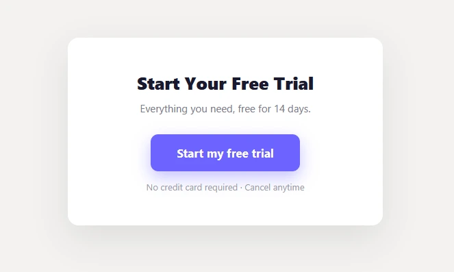
A call to action button with reassurance microcopy underneath, like No credit card required

Words to cut from your buttons

Retire “Submit,” “Click here,” “Enter,” and “Learn more” (when something more specific fits). They describe the mechanism, not the outcome. Replace each with what the visitor actually gets: “Learn more” becomes “See pricing,” “Submit” becomes “Create my account.” On a store, “Add to Cart” already does this well – it’s specific and action-led, which is exactly why it works.

How to test your call to action copy

Don’t argue about wording in a meeting – test it. Run two versions of the same button with different labels, send equal traffic to each, and measure the click-through rate. Change only the words so you know they’re what moved the number. Your audience settles the debate faster than any best-practice list.

The takeaway

Your button’s design gets it noticed; its copy gets it clicked. Lead with a verb, say exactly what the visitor gets, keep it short, and back it with a line of reassurance – then test. Pair sharp copy with a high-contrast button color and you’ve optimized both levers you control on any button. It all comes back to one goal: directing attention to the one action that matters.

Frequently asked questions

What makes good call to action copy? It’s specific, leads with an action verb, is framed around the visitor’s benefit, and stays under about five words – so the reader knows exactly what happens when they click.

Is “Submit” a bad button label? Yes. It’s vague and describes the mechanism, not the outcome. Replace it with what the visitor gets, like “Get my quote” or “Create my account.”

Should CTA buttons say “my” or “your”? Test both, but “my” (“Start my free trial”) often wins because it reads as the visitor’s own voice rather than a command.
How to Choose a CTA Button Color That Converts (It’s Not Red vs Green)

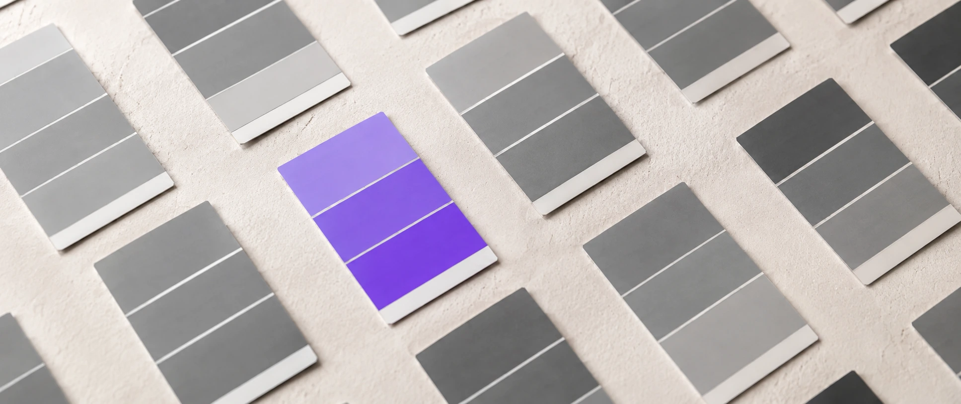
A vibrant purple paint swatch standing out among grey swatches, illustrating CTA button color

Search “best CTA button color” and you’ll find a hundred articles fighting over red versus green versus orange. They’re all answering the wrong question.

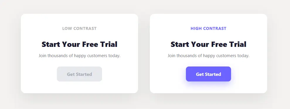
The best CTA button color isn’t a specific color at all – it’s whichever color contrasts most with everything around it. A button only converts if it gets noticed, and getting noticed is relative to your page, not a universal hex code. A red button that crushes it on one site flops on another. Here are five rules for choosing a CTA button color that actually converts.

Example of a high-contrast CTA button color on a web page

The red-vs-green myth

You’ve probably seen the famous A/B test where a red button beat a green one and got quoted forever as proof that “red converts best.” Here’s the catch: in that test, the page was green-themed, so the red button was simply the highest-contrast element on it. On a red-themed page, green would have won. It was never about red – it was about standing out. That’s why “best color” studies endlessly contradict each other: they’re all measuring contrast and crediting the color.

5 rules for choosing a CTA button color

1. Pick the color that contrasts most with your page. Your button should be the single highest-contrast element on the screen. If your theme is cool and blue, a warm orange or your purple pops. If your palette is warm, a cool button pops. Start from your page, not a listicle.

2. Reserve that color for the primary action only. A color that also appears on links, icons, and headings stops signaling “click me.” Use one dedicated color that nothing else on the page wears, so the eye always knows where the action is. This is contrast applied deliberately – the core of visual hierarchy.

3. Keep the text on it readable. A trendy color that makes the label hard to read costs you clicks and fails accessibility. Aim for strong contrast between the button color and its text (dark text on light buttons, white on dark/saturated ones).

4. Don’t reuse the CTA color elsewhere as decoration. If your “Add to Cart” button and a random badge share a color, visitors get confused about what’s clickable. One job, one color.

5. Test it on your page, not from an article. What converts is page-specific. Pick your highest-contrast candidate, then measure the click-through rate against an alternative. The data from your own visitors beats any color chart.

What about color psychology?

You’ll see charts claiming red means urgency, green means go, blue means trust. There’s a sliver of cultural truth to it, but it’s wildly overstated and context-dependent, and it varies by culture and audience. Contrast, clarity, and consistency beat psychology every time. Don’t choose your CTA button color from a “color meanings” infographic – choose it from contrast with your page, brand fit, and readability.

A 10-second test for your button color

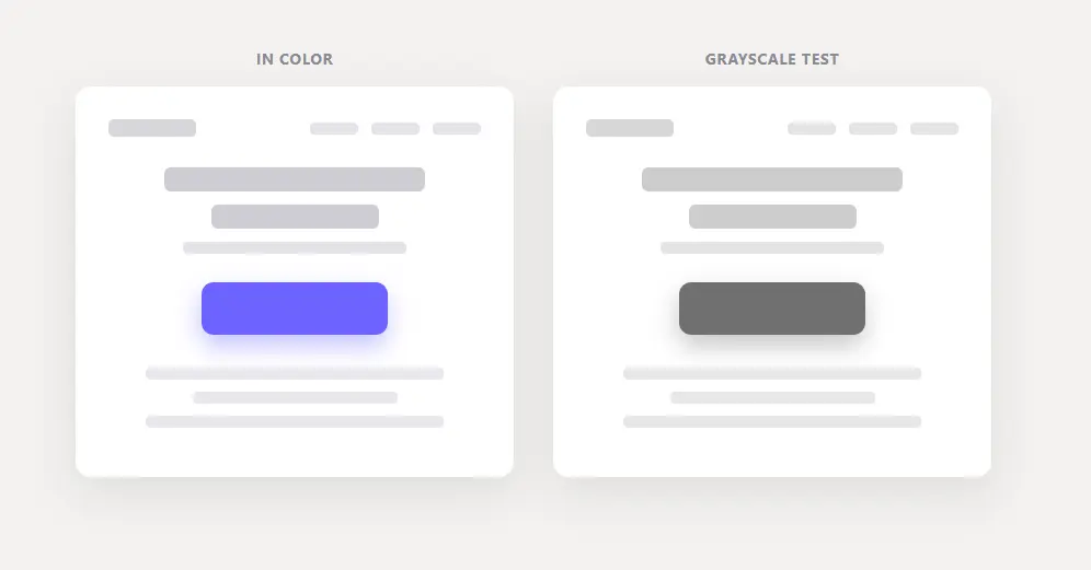
Convert your page to grayscale (your browser’s dev tools or any image editor can do it), or just squint at it. If the button still clearly stands out in grayscale, its contrast is doing the work and it’ll pop for everyone – including the ~1 in 12 men with color vision deficiency. If it vanishes in grayscale, it’s relying on hue alone, and it’s weaker than you think.

The same web page in color and grayscale, with the CTA button still standing out in grayscale

The takeaway

Stop hunting for a magic color. The best CTA button color is the one that contrasts most with your specific page, is reserved for your one primary action, and stays easy to read. Choose on those three, then test. That’s the whole answer the red-vs-green debate keeps missing. It’s also exactly how you make your Add to Cart button stand out on a store. Color is only half of a button – the words on it matter just as much. Here’s how to write call-to-action copy that converts. Nailing the color is one piece of the bigger goal – increasing your landing page conversions.

Frequently asked questions

What is the best color for a CTA button? The one with the most contrast against the rest of your page. There’s no universal best color – a button converts when it stands out, and what stands out depends on your page’s palette.

Does red or green convert better? Neither, universally. In the tests where red “won,” red was just the highest-contrast color on that particular page. On a differently colored page, the result flips.

What CTA button color gets the most clicks? The highest-contrast one on your specific page, reserved for your primary action and readable. Test two candidates on your own traffic to confirm.

How to Use Visual Hierarchy to Guide Your Visitors’ Eyes

One large purple card standing out among small grey cards, illustrating visual hierarchy in web design

When everything on a page competes for attention, nothing wins. Visitors don’t read web pages, they scan them – and if your design doesn’t tell their eyes where to go, they leave without ever seeing the thing that mattered.

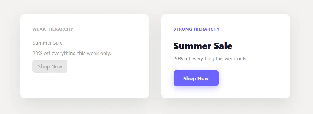
Visual hierarchy in web design is the practice of arranging elements so the eye moves through them in the order you intend, most important first. You build it with size, contrast, spacing, and position. Get it right and visitors reach your key action almost automatically. Here are seven simple rules to guide their eyes.

visual hierarchy in web design

What visual hierarchy is (and why it decides whether visitors act)

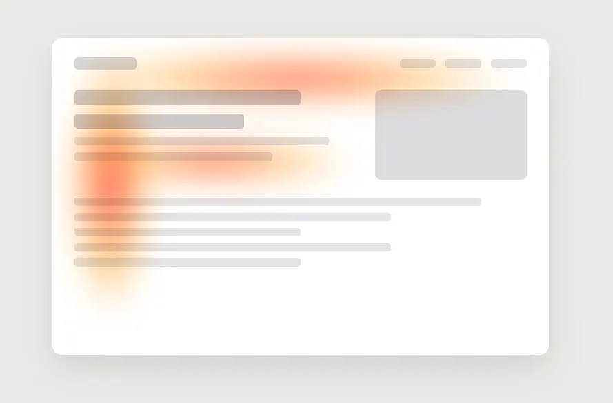
Visual hierarchy is the order in which your design leads the eye. It matters because people scan in predictable patterns – eye-tracking research from the Nielsen Norman Group shows most visitors read in an “F” shape, skimming the top and left and skipping the rest. If your most important element sits outside that path, or looks like everything around it, it simply never gets seen. This is the same idea behind our guide on how to increase landing page conversions – attention is the bottleneck.

Example of visual hierarchy in web design guiding the eye to the main button

7 rules of visual hierarchy in web design

1. Size – bigger reads as more important. Make your primary element (headline, main button) clearly the largest thing in its area. If your call to action is the same size as your body text, you’re telling the eye it’s equally unimportant.

2. Contrast – the eye goes to whatever stands out most. Reserve your boldest color for the single action you want people to take. If that color also appears on links, icons, and headings, the button drowns in it. Contrast is relative, so one loud element only works when the rest are quiet. It is also why the right button color is about contrast, not a magic hue – see how to pick a CTA button color that converts.

3. Whitespace – space signals importance. Crowding an element makes it disappear; giving it room makes it feel deliberate and premium. Add padding around your key action so nothing crowds it.

4. Position – top and left get seen first. Because of that F-pattern, the top-left region carries the most attention. Put your most important message and action where eyes naturally start, not buried three scrolls down.

F-shaped eye-tracking pattern showing how visitors scan a web page

5. Typography – use weight and scale to set reading order. A clear step from big bold headings to medium subheads to smaller body text guides people through the page in sequence. When every line is the same weight, readers have to work to find the point, and most won’t.

6. Grouping – keep related things together. Placing related items close (a price next to its buy button, a label next to its field) reduces mental effort and makes the layout feel organized. Proximity tells people what belongs with what before they read a word.

7. Direction and motion – point the eye where you want it. Faces looking toward a button, arrows, and lines all pull attention along a path. Motion is the strongest of these – the eye is wired to notice movement first. A subtle animated cue on your key action is the most direct way to apply this, and a free plugin like GlanceLeader adds one by clicking the element, no code. On a store, this is exactly how you make your Add to Cart button stand out.

A 5-second way to test your hierarchy

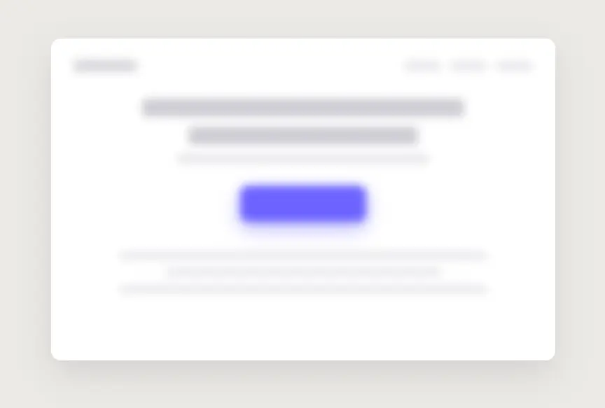
Squint at your page until it blurs, or show it to someone for five seconds and take it away. Then ask: what stood out? If the first thing they noticed is not the action you care about, your hierarchy is working against you – and one of the seven rules above is the fix.

Blurred web page where the main purple button still stands out, a squint test for visual hierarchy

The takeaway

Visual hierarchy is how you guide visitors without saying a word. Decide the one thing you want them to do on a page, then use size, contrast, whitespace, and position to make it the loudest thing there. Everything else should be visibly quieter. Do that, and the eye goes where you want it – which is the whole game.

Frequently asked questions

What is visual hierarchy in web design? It is the deliberate arrangement of elements so the eye moves through them in a set order, guided by size, contrast, spacing, and position, with the most important element standing out most.

What are the main principles of visual hierarchy? Size, color and contrast, whitespace, position, typography scale, grouping (proximity), and directional cues including motion.

How do I know if my visual hierarchy is working? Use the squint or five-second test: if the first thing people notice isn’t your primary action, adjust its size, contrast, or spacing until it is.

How to Increase Landing Page Conversions (Without Changing a Word of Your Copy)

A single purple flag standing out among grey flags, illustrating how to increase landing page conversions

You rewrote the headline four times. You tested the offer. You changed the button from green to orange. And conversions barely moved.

But here is the uncomfortable truth: the fastest way to increase landing page conversions usually has nothing to do with your words. The problem isn’t your copy – it’s that visitors never actually see your call to action in the first place. You can’t click what you don’t notice.

This is a well-documented pattern called banner blindness: decades of eye-tracking studies by the Nielsen Norman Group show people skip straight past anything that looks like a banner or a secondary element.

This post is about the cheapest, fastest lever in conversion optimization: directing attention. No redesign. No rewrite. Just making sure the one action you care about is the one thing people can’t miss.

Why visitors miss your most important button

People don’t read web pages – they scan them. Eye-tracking studies have shown for years that visitors skim in an F-shaped pattern, skipping most of the page and tuning out anything that looks like an ad or a decoration (a habit called “banner blindness”).

That means attention is a scarce resource, and every element on your page is competing for it: your logo, your menu, your hero image, three testimonials, a chat bubble, and – somewhere in there – your actual call to action. If your CTA doesn’t win that competition, it’s effectively invisible. More traffic won’t fix it. Better copy won’t fix it. The bottleneck is attention.

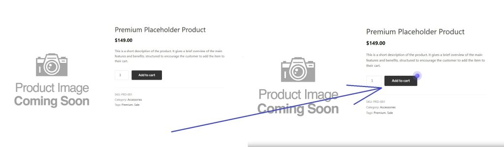
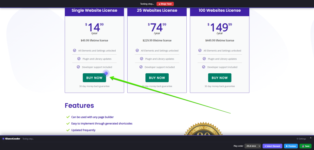
Add to Cart button before and after an animated cue to increase landing page conversions

The one-page, one-action rule

Before any tactic, a principle: every page should have exactly one primary action.

Pick the single thing you most want a visitor to do on this page – Add to Cart, Start free trial, Book a call – and treat everything else as secondary. When two or three CTAs shout with equal volume, they cancel each other out. Clarity converts; choice paralyzes.

Once you’ve named that one action, your only job is to point the eye at it.

5 ways to direct attention to your CTA

  1. Contrast. Give your button a color that appears nowhere else on the page and here’s how to choose the right CTA button color. If your brand is blue and your buttons are blue and your links are blue, nothing stands out. Reserve one accent color for the action.
  2. Whitespace. Space signals importance. Crowd a button with surrounding elements and it disappears; give it room to breathe and the eye lands on it naturally.
  3. Directional cues. People look where faces look and where lines point. A product photo angled toward the button, or a subtle arrow, guides the gaze without a word.
  4. Reduce competition. The fastest win is often subtraction. Remove or mute the secondary links, the redundant menu items, the third testimonial. Less noise, louder signal.
  5. Motion. A small, deliberate animation is the single strongest attention magnet you have – and the most underused. The human eye is wired to detect movement before anything else. We’ll come back to this one, because it’s the big lever.

Taken together, these five tactics are really one skill: guiding your visitors’ eyes with visual hierarchy.

Running a WooCommerce store? Here’s how to put all of this to work on your most important button: how to make your Add to Cart button stand out.

Why motion beats everything else

Your brain processes movement preattentively – that is, before conscious thought. It’s a survival instinct: motion in the corner of your eye gets noticed in under 100 milliseconds, whether you want it to or not.

That’s exactly why a subtly pulsing button outperforms a static one. You’re not persuading the visitor to look; you’re triggering a reflex that makes them look. Applied to your primary CTA, that reflex is worth more than any color tweak.

The catch: motion is powerful, so it’s easy to overdo. Three rules keep it effective instead of annoying:

  • One element only. Animate the primary action, nothing else. Two moving things is zero moving things.
  • Subtle, not frantic. A slow pulse or a soft glow, not a bouncing, flashing carnival.
  • Respect accessibility. Some visitors set “reduce motion” in their system settings. Honor it – show them a static, still-prominent version.

How to add an attention cue to your CTA (no code)

You don’t need a developer or a page builder to do this. A plugin like GlanceLeader lets you add a subtle animated cue to any element by clicking it – no CSS, no JavaScript.

The workflow:

  1. Install GlanceLeader and open the visual editor on your live page.
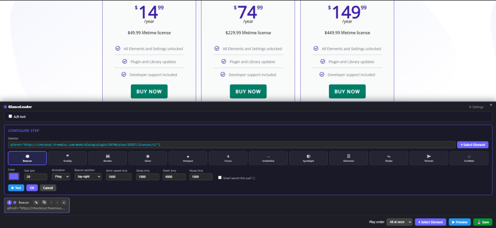
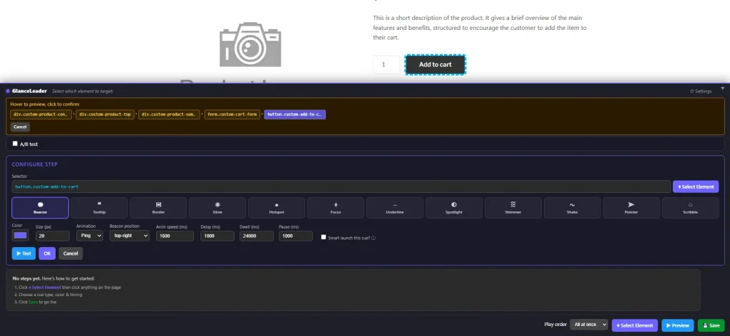
  2. Click Select Element, then click your primary button – your Add to Cart, your signup CTA, whatever it is.
  3. Pick a subtle cue. A beacon (a gentle sonar pulse), a glow, or a soft border work best for a call to action – eye-catching without being obnoxious.
  4. Choose your accent color and save.
Selecting a button in the GlanceLeader visual editor to add an attention cue

That’s it. It works on any theme, and on WooCommerce it’s one of the most effective places to use it – drawing the eye straight to Add to Cart on a product page. And because it respects the visitor’s reduced-motion preference automatically, you get the conversion lift without the accessibility trade-off.

Measure it – don’t guess

Attention tactics are testable, so test them. Note your button’s click-through rate for a week, add the cue, and watch the next week. GlanceLeader’s built-in analytics track impressions and clicks per campaign so you can see the before-and-after on your own page, but even a glance at your existing analytics will tell you if the needle moved. Keep what works, drop what doesn’t.

The takeaway: how to actually increase landing page conversions

Traffic gets people to your page. Attention gets them to act. Most conversion advice obsesses over the first and ignores the second – which is why so many “optimized” pages still underperform.

Direct the eye to your one primary action, and conversions tend to follow. No redesign. No new copy. Just making the important thing look important.

That’s exactly what GlanceLeader is built to do – highlight your one key action in a couple of clicks, no code.

Frequently asked questions

What’s the fastest way to increase landing page conversions? Make your primary call to action impossible to miss. Most pages lose conversions not to weak copy but to a CTA that blends in – fixing its visibility is faster and cheaper than a redesign.

Does animating a button actually increase conversions? A subtle animation draws the eye because the brain detects motion reflexively, before conscious attention. Applied to a single primary button – and kept tasteful – it reliably increases the share of visitors who notice and click it. Always measure on your own page.

How do I make my Add to Cart button stand out? Give it a color used nowhere else, surround it with whitespace, and add a subtle animated cue (a pulse, glow, or border). Tools like GlanceLeader let you add that cue by clicking the button – no code required.

©2026 - GlanceLeader