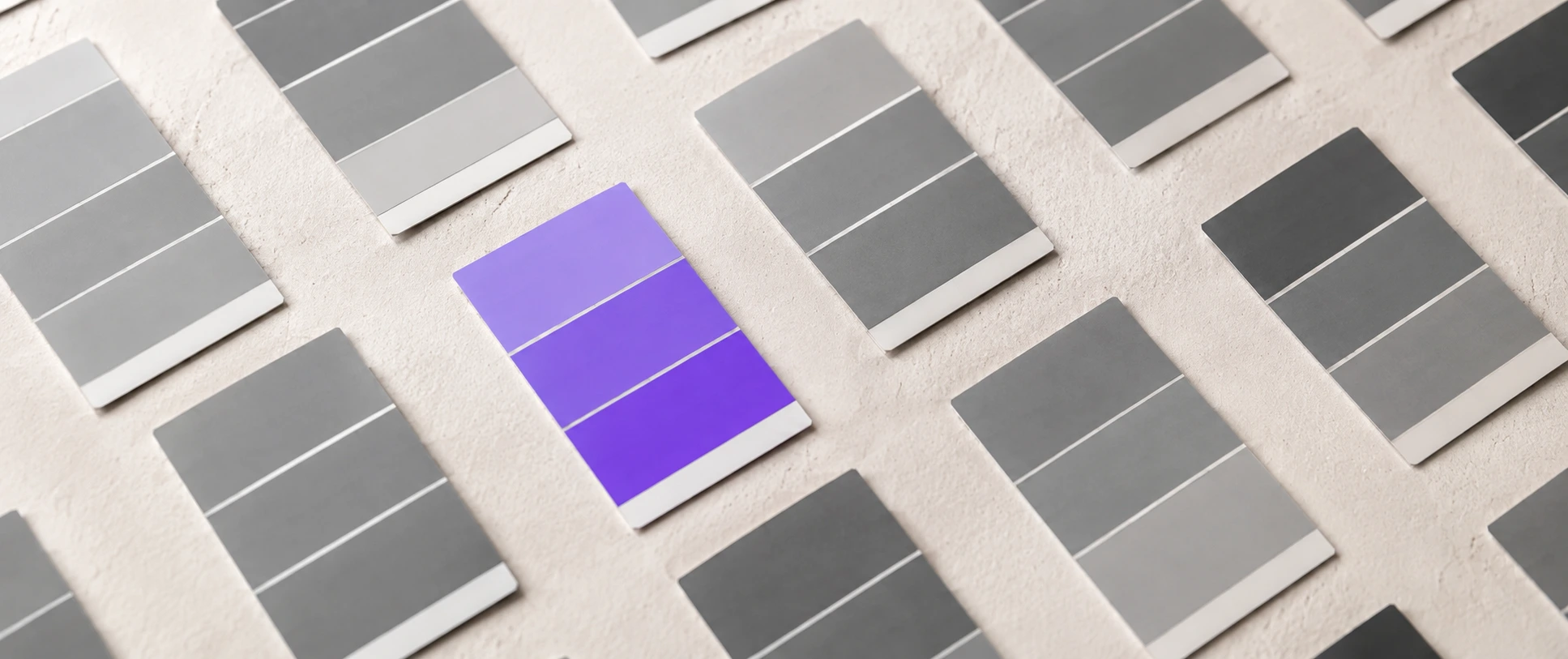
Search “best CTA button color” and you’ll find a hundred articles fighting over red versus green versus orange. They’re all answering the wrong question.
The best CTA button color isn’t a specific color at all – it’s whichever color contrasts most with everything around it. A button only converts if it gets noticed, and getting noticed is relative to your page, not a universal hex code. A red button that crushes it on one site flops on another. Here are five rules for choosing a CTA button color that actually converts.

Table of Contents
The red-vs-green myth
You’ve probably seen the famous A/B test where a red button beat a green one and got quoted forever as proof that “red converts best.” Here’s the catch: in that test, the page was green-themed, so the red button was simply the highest-contrast element on it. On a red-themed page, green would have won. It was never about red – it was about standing out. That’s why “best color” studies endlessly contradict each other: they’re all measuring contrast and crediting the color.
5 rules for choosing a CTA button color
1. Pick the color that contrasts most with your page. Your button should be the single highest-contrast element on the screen. If your theme is cool and blue, a warm orange or your purple pops. If your palette is warm, a cool button pops. Start from your page, not a listicle.
2. Reserve that color for the primary action only. A color that also appears on links, icons, and headings stops signaling “click me.” Use one dedicated color that nothing else on the page wears, so the eye always knows where the action is. This is contrast applied deliberately – the core of visual hierarchy.
3. Keep the text on it readable. A trendy color that makes the label hard to read costs you clicks and fails accessibility. Aim for strong contrast between the button color and its text (dark text on light buttons, white on dark/saturated ones).
4. Don’t reuse the CTA color elsewhere as decoration. If your “Add to Cart” button and a random badge share a color, visitors get confused about what’s clickable. One job, one color.
5. Test it on your page, not from an article. What converts is page-specific. Pick your highest-contrast candidate, then measure the click-through rate against an alternative. The data from your own visitors beats any color chart.
What about color psychology?
You’ll see charts claiming red means urgency, green means go, blue means trust. There’s a sliver of cultural truth to it, but it’s wildly overstated and context-dependent, and it varies by culture and audience. Contrast, clarity, and consistency beat psychology every time. Don’t choose your CTA button color from a “color meanings” infographic – choose it from contrast with your page, brand fit, and readability.
A 10-second test for your button color
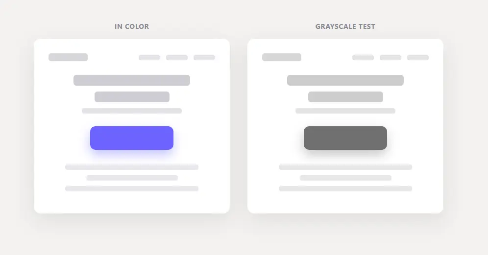
Convert your page to grayscale (your browser’s dev tools or any image editor can do it), or just squint at it. If the button still clearly stands out in grayscale, its contrast is doing the work and it’ll pop for everyone – including the ~1 in 12 men with color vision deficiency. If it vanishes in grayscale, it’s relying on hue alone, and it’s weaker than you think.
The takeaway
Stop hunting for a magic color. The best CTA button color is the one that contrasts most with your specific page, is reserved for your one primary action, and stays easy to read. Choose on those three, then test. That’s the whole answer the red-vs-green debate keeps missing. It’s also exactly how you make your Add to Cart button stand out on a store. Color is only half of a button – the words on it matter just as much. Here’s how to write call-to-action copy that converts. Nailing the color is one piece of the bigger goal – increasing your landing page conversions.
Frequently asked questions
What is the best color for a CTA button? The one with the most contrast against the rest of your page. There’s no universal best color – a button converts when it stands out, and what stands out depends on your page’s palette.
Does red or green convert better? Neither, universally. In the tests where red “won,” red was just the highest-contrast color on that particular page. On a differently colored page, the result flips.
What CTA button color gets the most clicks? The highest-contrast one on your specific page, reserved for your primary action and readable. Test two candidates on your own traffic to confirm.