
When everything on a page competes for attention, nothing wins. Visitors don’t read web pages, they scan them – and if your design doesn’t tell their eyes where to go, they leave without ever seeing the thing that mattered.
Visual hierarchy in web design is the practice of arranging elements so the eye moves through them in the order you intend, most important first. You build it with size, contrast, spacing, and position. Get it right and visitors reach your key action almost automatically. Here are seven simple rules to guide their eyes.

Table of Contents
What visual hierarchy is (and why it decides whether visitors act)
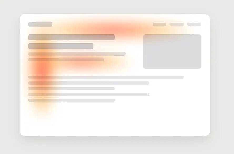
Visual hierarchy is the order in which your design leads the eye. It matters because people scan in predictable patterns – eye-tracking research from the Nielsen Norman Group shows most visitors read in an “F” shape, skimming the top and left and skipping the rest. If your most important element sits outside that path, or looks like everything around it, it simply never gets seen. This is the same idea behind our guide on how to increase landing page conversions – attention is the bottleneck.

7 rules of visual hierarchy in web design
1. Size – bigger reads as more important. Make your primary element (headline, main button) clearly the largest thing in its area. If your call to action is the same size as your body text, you’re telling the eye it’s equally unimportant.
2. Contrast – the eye goes to whatever stands out most. Reserve your boldest color for the single action you want people to take. If that color also appears on links, icons, and headings, the button drowns in it. Contrast is relative, so one loud element only works when the rest are quiet. It is also why the right button color is about contrast, not a magic hue – see how to pick a CTA button color that converts.
3. Whitespace – space signals importance. Crowding an element makes it disappear; giving it room makes it feel deliberate and premium. Add padding around your key action so nothing crowds it.
4. Position – top and left get seen first. Because of that F-pattern, the top-left region carries the most attention. Put your most important message and action where eyes naturally start, not buried three scrolls down.
5. Typography – use weight and scale to set reading order. A clear step from big bold headings to medium subheads to smaller body text guides people through the page in sequence. When every line is the same weight, readers have to work to find the point, and most won’t.
6. Grouping – keep related things together. Placing related items close (a price next to its buy button, a label next to its field) reduces mental effort and makes the layout feel organized. Proximity tells people what belongs with what before they read a word.
7. Direction and motion – point the eye where you want it. Faces looking toward a button, arrows, and lines all pull attention along a path. Motion is the strongest of these – the eye is wired to notice movement first. A subtle animated cue on your key action is the most direct way to apply this, and a free plugin like GlanceLeader adds one by clicking the element, no code. On a store, this is exactly how you make your Add to Cart button stand out.
A 5-second way to test your hierarchy
Squint at your page until it blurs, or show it to someone for five seconds and take it away. Then ask: what stood out? If the first thing they noticed is not the action you care about, your hierarchy is working against you – and one of the seven rules above is the fix.

The takeaway
Visual hierarchy is how you guide visitors without saying a word. Decide the one thing you want them to do on a page, then use size, contrast, whitespace, and position to make it the loudest thing there. Everything else should be visibly quieter. Do that, and the eye goes where you want it – which is the whole game.
Frequently asked questions
What is visual hierarchy in web design? It is the deliberate arrangement of elements so the eye moves through them in a set order, guided by size, contrast, spacing, and position, with the most important element standing out most.
What are the main principles of visual hierarchy? Size, color and contrast, whitespace, position, typography scale, grouping (proximity), and directional cues including motion.
How do I know if my visual hierarchy is working? Use the squint or five-second test: if the first thing people notice isn’t your primary action, adjust its size, contrast, or spacing until it is.