
Your Add to Cart button is the most important pixel on a WooCommerce product page. It is the one click that turns a browser into a buyer. Yet on most stores it looks like every other button on the page, and shoppers scroll right past it.
To make your Add to Cart button stand out, give it a color nothing else on the page uses, surround it with whitespace, keep it visible without scrolling, and draw the eye to it with a subtle animated cue. None of this needs code or a redesign. Here are seven simple ways to do it, from the quickest wins to the ones worth testing.
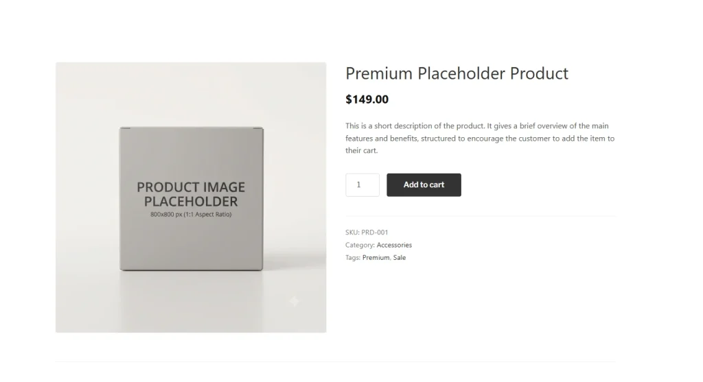
Table of Contents
First, why your Add to Cart button gets ignored
If your button shares the same color, size, and weight as your menu, links, and theme accents, the eye has no reason to land on it. Standing out is about contrast, not decoration.
That’s really just visual hierarchy applied to a single button – the same principle behind directing attention anywhere on a page.
7 ways to make your Add to Cart button stand out
1. Give it a color nothing else uses. Contrast is what the eye notices. Pick a button color that does not appear anywhere else on the product page. If your theme’s accent already colors your links and headings, your button dissolves into the design. The exact shade matters far less than the contrast – here’s how to choose a CTA button color that converts.
2. Surround it with whitespace. Space signals importance. Give the button room to breathe so it is not crowded by the price, variation dropdowns, or description text.
3. Keep it above the fold, and sticky on scroll. Shoppers should see it without scrolling. On long mobile product pages, add a sticky Add to Cart bar that follows them down the page.
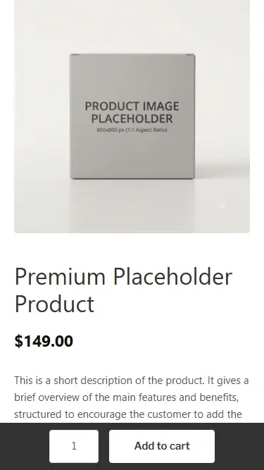
4. Make it big enough to tap. On mobile, a small button is a lost sale. Aim for a tap target of at least 44×44 pixels.
5. Use clear, action-focused button text. “Add to Cart” beats vague or clever labels. Any wording that makes a shopper pause to decode it costs you clicks. The words matter as much as the design – here’s how to write call-to-action copy that gets clicks.
6. Mute the competing buttons. If “Add to Wishlist,” social share, and “Continue shopping” all shout as loudly as Add to Cart, none of them win. Make secondary actions visually quieter so the primary one leads.
7. Draw the eye with a subtle animated cue. Motion is the strongest attention magnet – the eye is wired to notice movement before anything else. A gentle pulse or glow on the button pulls focus without touching your layout. A free plugin like GlanceLeader lets you add one by clicking the button, no code required.
How to tell if it’s working
Do not guess – measure your add-to-cart rate (or clicks on the button) before and after each change, and change one thing at a time so you know what actually moved the needle. Years of e-commerce usability research from the Baymard Institute back this up: small, tested changes to the buy flow compound.
The takeaway
Making your Add to Cart button stand out is the cheapest conversion win in WooCommerce. You are not redesigning your store or rewriting product copy – you are just making the one action that matters look like it matters. Start with contrast and whitespace, then test a subtle cue.
Frequently asked questions
Why is my Add to Cart button hard to see? Usually because it shares the same color, size, and weight as other elements on the page, so it blends in. Increase its contrast against everything around it.
What color should an Add to Cart button be? There is no magic color. What matters is contrast – pick a color that is not used elsewhere on the product page so the button pops.
Should the Add to Cart button be above the fold? Yes. Ideally it is visible without scrolling, and on mobile a sticky Add to Cart bar keeps it in reach as the shopper scrolls.